Design your Own Acetate Window Card in Design Space
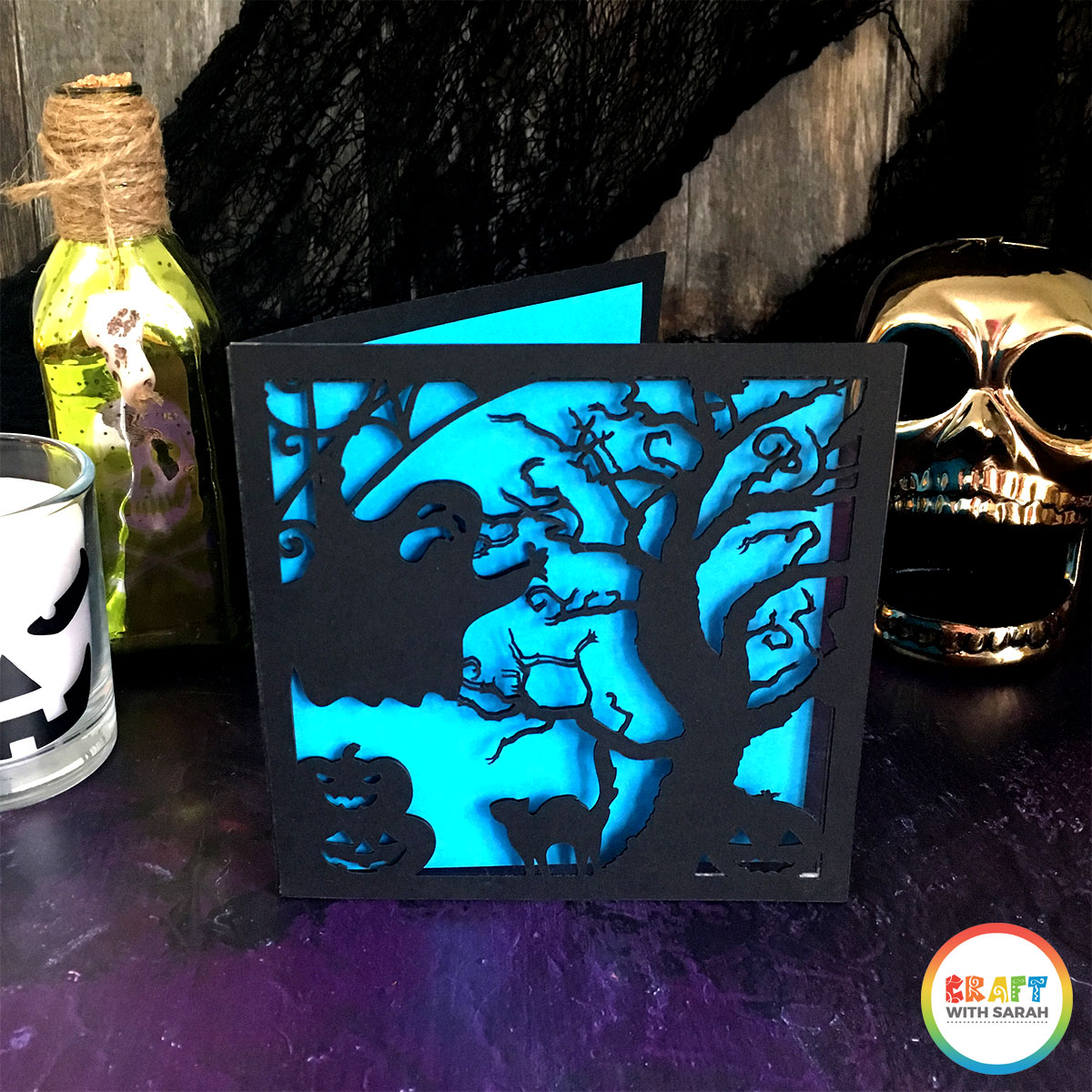
Design your own Halloween cards with a twist with this fun acetate window concept.
Designing cards in Cricut Design Space is one of my favourite things to do.
I love how you can go from a blank, empty screen to a beautiful card in hardly any time at all.
Here is how I design my window acetate cards…
Contents:
Please note that some of the links included in this article are affiliate links, which means that if you click through and make a purchase I may receive a commission (at no additional cost to you). You can read my full disclosure at the bottom of the page.
About this project
In this Design Space tutorial I’ll show you how to design your own handmade cards in Design Space.
These cards feature an acetate “window” to show your design on, which is really pretty as it shows through to the coloured paper insert inside.
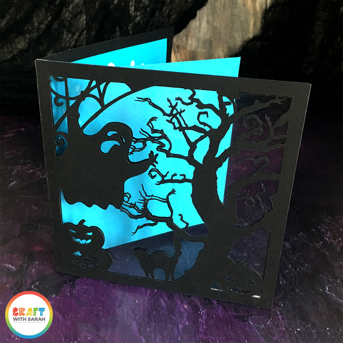
You could cut the insert from a patterned paper for an extra special appearance!
This technique can be used for other cards too, such as birthdays, Christmas, weddings and more!
During this card making tutorial, you’ll learn how to use Design Space features such as Shapes, Slice, Weld, Contour and more.
Don’t want to design your own? No worries – just use mine:
[cws_clubhouse design=’1100′]
Video tutorial for designing cards in Design Space
Watch this video to see how to design your own acetate window cards in Cricut design space.
A full written tutorial is available further down on this page.
[cws_halloween2020]
How to design an acetate window card in Design Space
I wanted to include a written tutorial for this project as I know that many of my readers prefer this to watching a video, however if you are new to Design Space then I’d recommend watching the video because you’ll be able to see exactly how I use the Design Space software, in real-time.
Here is how to design your acetate window card in Design Space…
Step 1) Choose your graphics
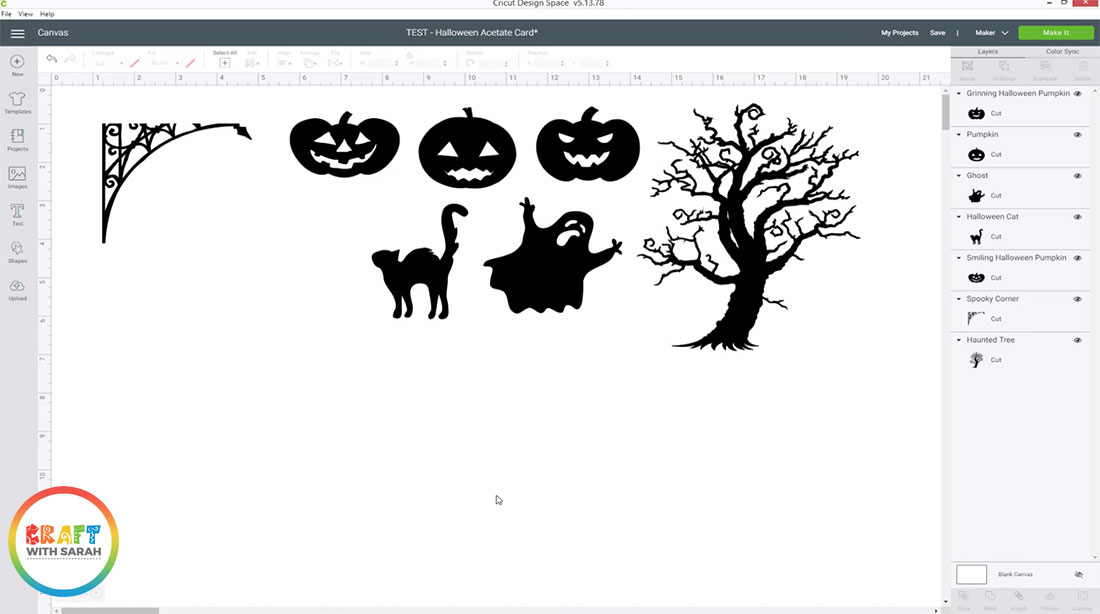
Choose the graphics you want to use on your card.
I’ve got a selection of Halloween images, but you could make a card for any theme – birthday, Christmas, weddings etc.
Choose images that are one layer and one colour. Make them all black as that will be easiest to work with.
Step 2) Create your base card
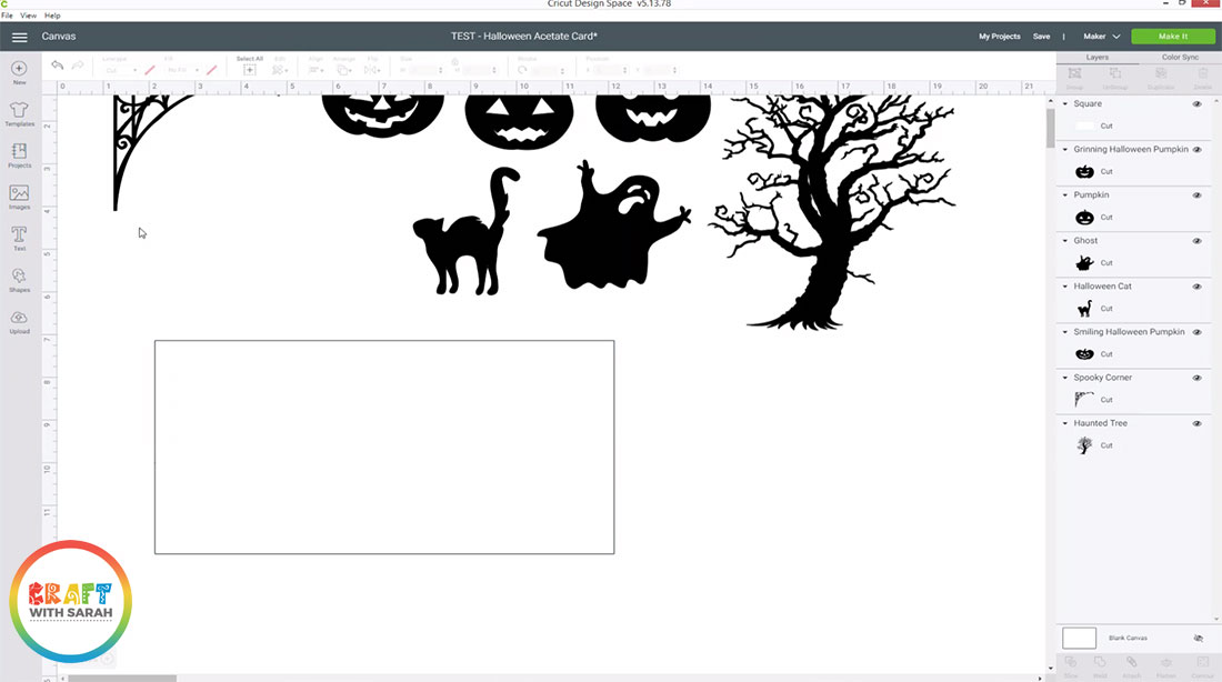
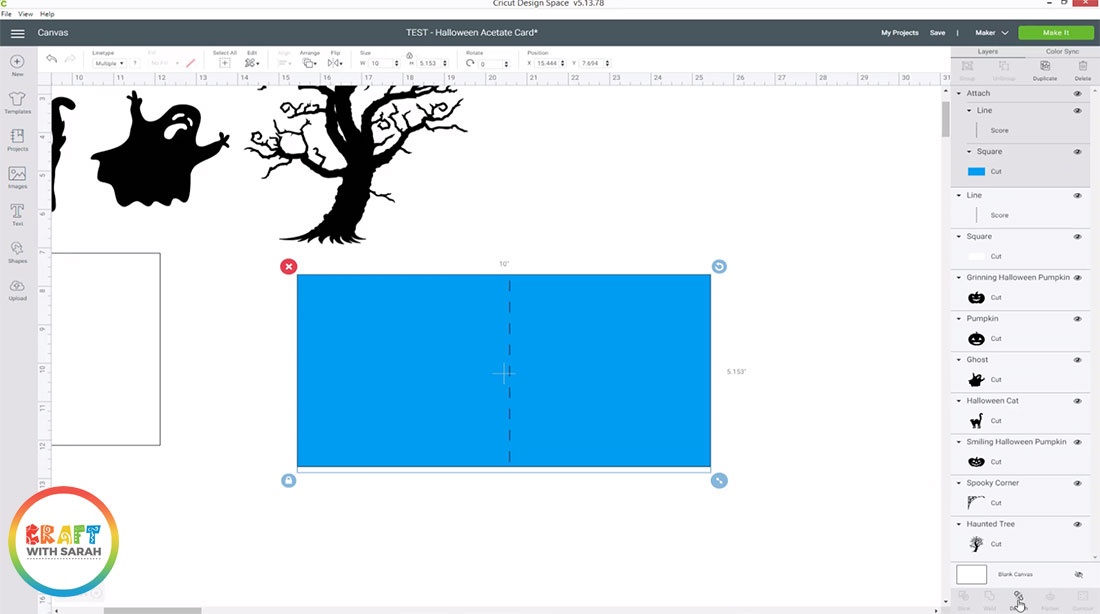
Create a rectangle that’s DOUBLE the width of the card you want to make, but the correct height.
E.g. to make a 5×5 inch card, you want a rectangle that’s 10 inches wide and 5 inches tall.
Make the rectangle white.
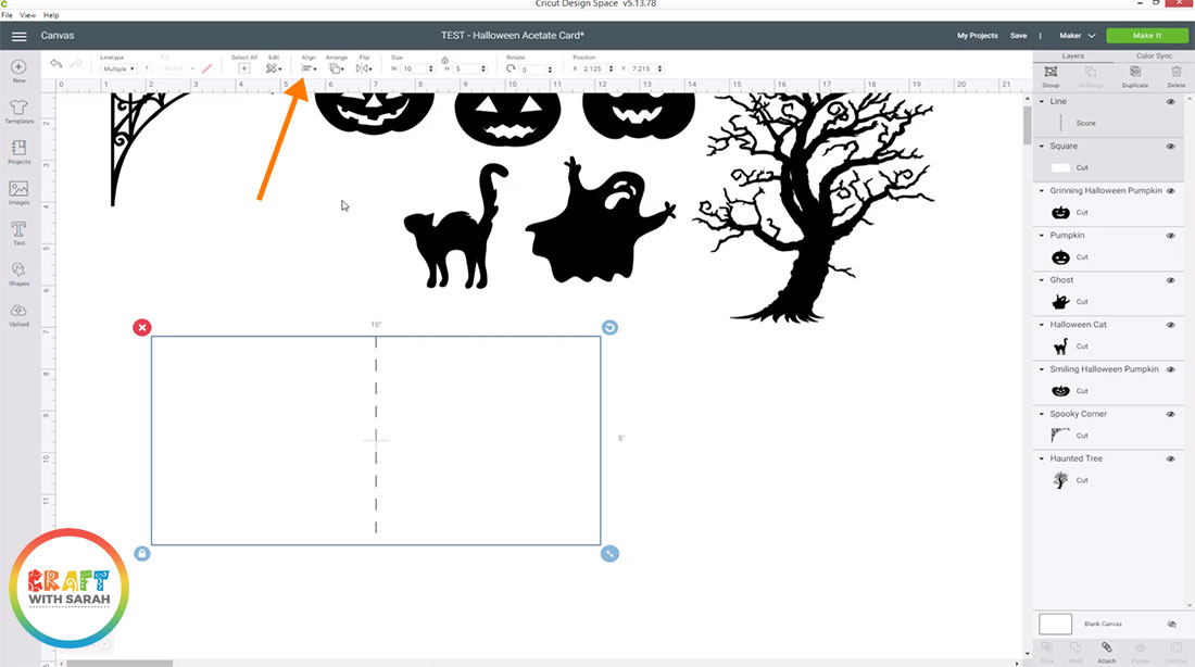
Click “Shapes” and choose “Score line”. Make this this same height as your rectangle (5 inches) and then select the score line and the rectangle and press “Align” > “Center” to perfectly place the score line in the middle of your rectangle.
3) Create the card insert
Select the score line and rectangle and right-click and press “Duplicate”.
Resize your duplicated rectangle to be 0.25 inches less tall, and let the width change automatically in proportion.
With these new layers select, press “Attach” at the bottom of the layers panel to join the score line to the insert rectangle.
Change the colour of the rectangle to the same colour that you will use for your insert so that you can easily tell that this is the insert rectangle.
4) Prepare your card base and window sections
Create a square the same size as the card you are making (5×5 inches).
Align this to the top and right side of your white rectangle.
Make another square and size this one slightly smaller, e.g. 4.5 inches. Align it in the middle of the preview square.
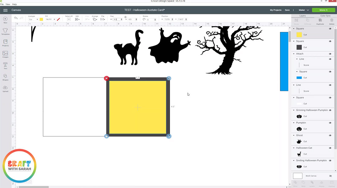
Select both of the new squares and press “Slice”. This will cut the smaller square out of the larger square.
Select the smaller 4.5 inch square and your white rectangle layer, and press slice.
Hide or delete the Slice Results that you don’t need, so that you are left with the following:
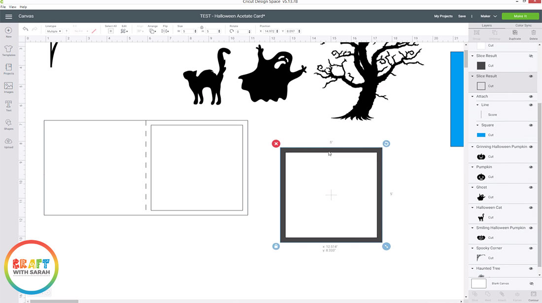
5) Create the acetate square
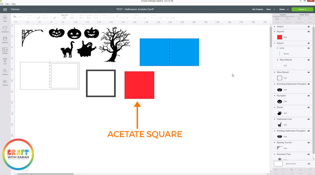
Create another square that’s the same size as your card front (5×5 inches).
This is the square that you will cut out from acetate.
6) Assemble your graphics
Create your window scene by assembling your chosen graphics onto the square frame.
Don’t worry if parts of the design go over the edge – we’ll fix that in the next step.
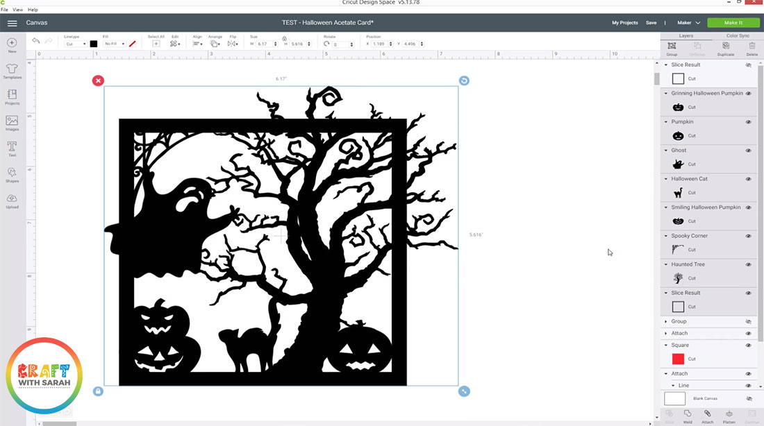
When you’re finished, select all your graphics and the square frame and press “Group” to add them all into a group.
Right-click on the Group and Duplicate it to make a copy. Hide this copy by clicking the little eye icon next to it in the Layers panel. This is our backup in case we need to come back to make changes later so that we have a copy of all of the separate layers.
7) Cut off any overhanging graphics
Right-click on the square frame layer and duplicate it. Roughly position it on top of the original, then select both layers and press “Align” > “Center” to make sure they are perfectly aligned one on top of the other.
Choose the original group of your design elements and press “Weld” to merge them all into one layer. Do NOT include your duplicated square frame in the Weld – this needs to be kept separate.
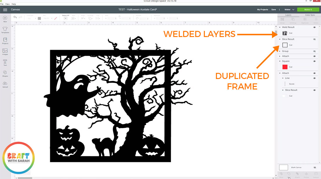
Draw rectangles on the screen that will sit about 50% of the way into the border of the square frame, and will cover up all the graphics that are overlapping.
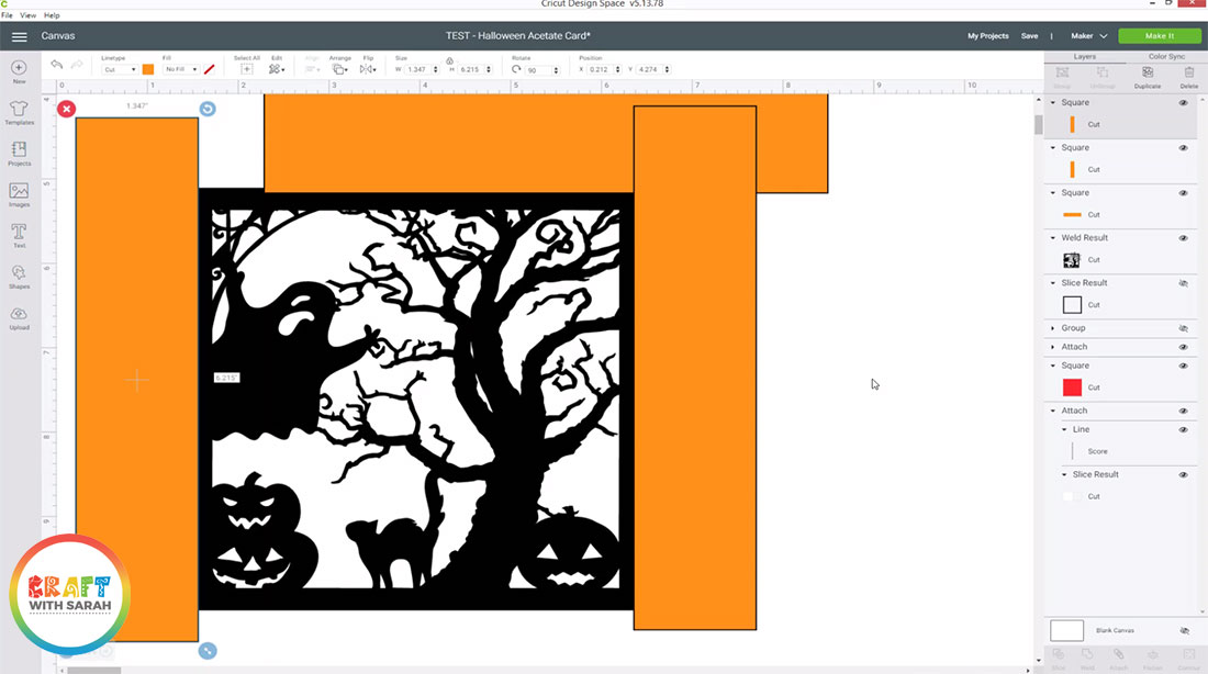
Select all rectangles and press “Weld” to join them together.
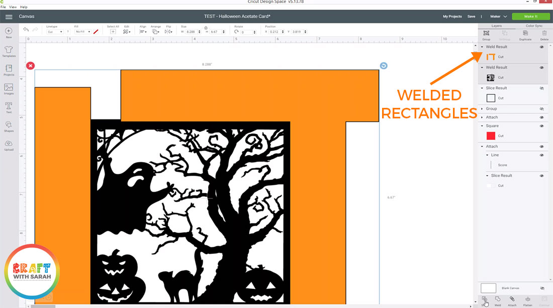
Select the rectangle layer and the welded layer of your design and then press “Slice”.
Delete all slice results apart from the one that shows your image with all the overlapping bits removed.
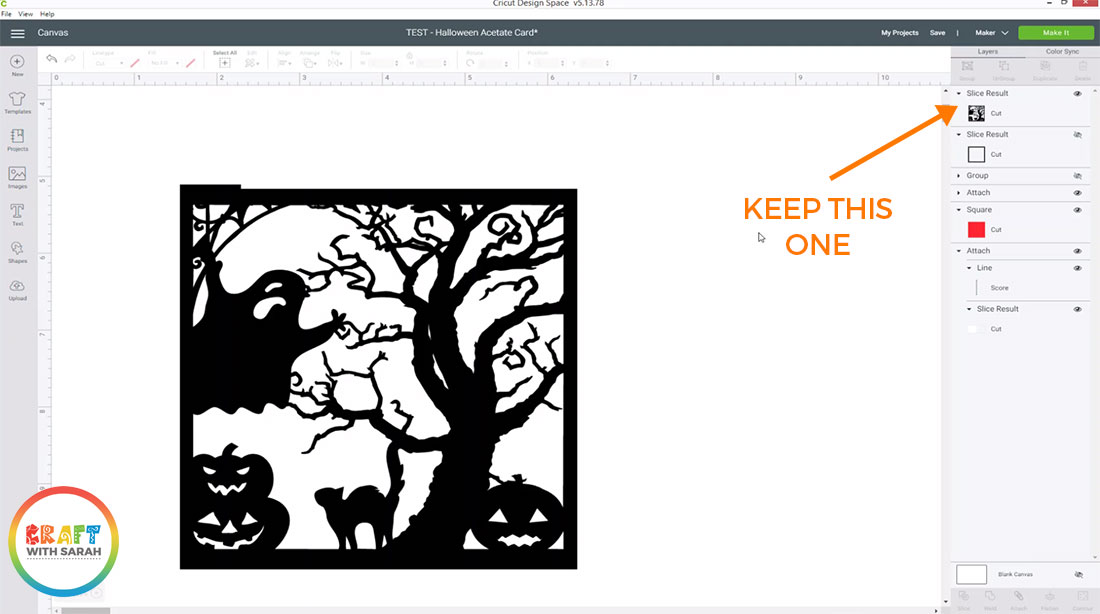
Weld together the duplicated frame and your main image to replace the parts of the border that the previous step removed.
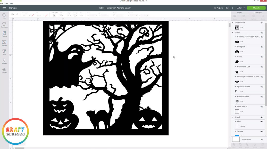
8) Remove any tiny gaps in your design
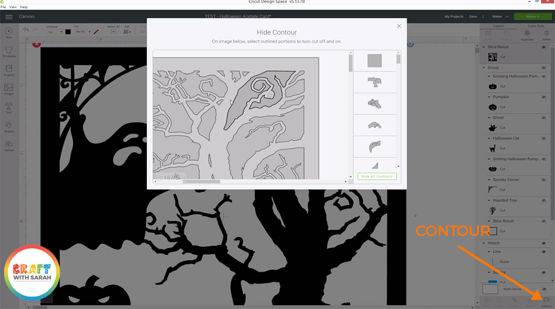
Your design may have some really small pieces in it that would be difficult (or impossible!) for your Cricut to cut.
Select your design layer and then press “Contour”.
This will open up a popup window. Click into the tiny gaps to “fill them in” so that your Cricut won’t try to cut them.
9) Create a mirror image of your graphic
Right-click on your design and press “Duplicate”.
At the top, click “Flip” and then “Flip horizontal”.
This will create a mirror image of your design to go inside your card when you stick it together. This will hide the glue that you’ll put on the acetate to give a neater appearance.
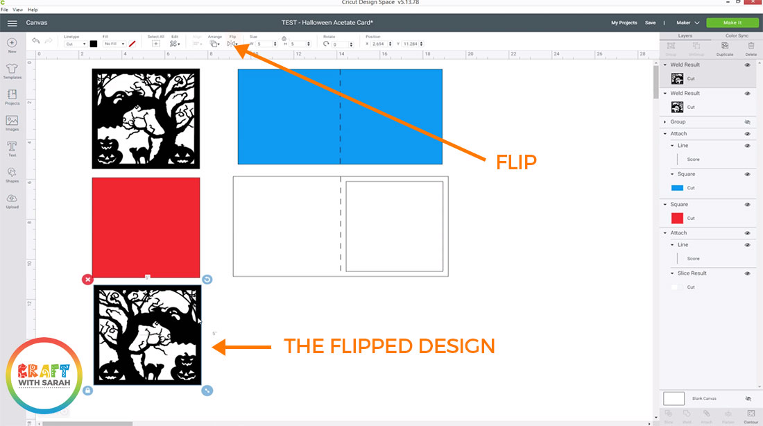
Your acetate window card is now ready to be cut out with your Cricut machine and stuck together.
How to assemble your acetate window card
Here’s how to stick all the pieces of your card together to create the finished product.
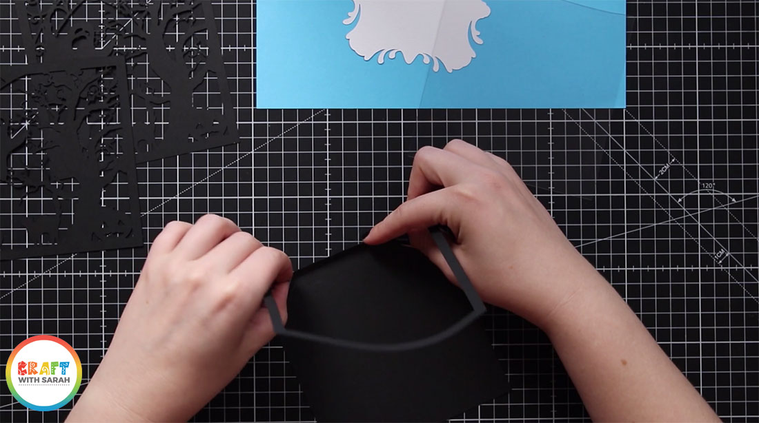
1) Fold the base card
Fold the base card along the score line. This can be a bit tricky due to the thin border, so be careful and take your time.
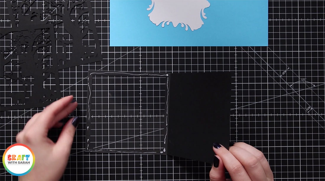
2) Stick the acetate to the card
Glue or double-sided tape the acetate square to the border of the card.
I stuck mine to the INSIDE of my card, but I think it would have been better to put it on the OUTSIDE as it would have been easier to stick, so I’d recommend doing it on the OUTSIDE.
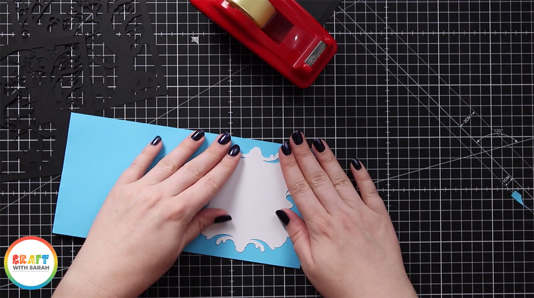
3) Prepare the insert
Whilst the glue on the acetate is drying, you can prepare the insert.
Fold it down the score line and then if your paper is a dark colour you may want to cut a shape from your Cricut machine in white card and stick it to the inside of your insert so that you can write on that and your pen will show up better than it would if you wrote straight onto the coloured insert paper.
Turn the insert upside down and run a strip of double sided tape down the side with the fold line.
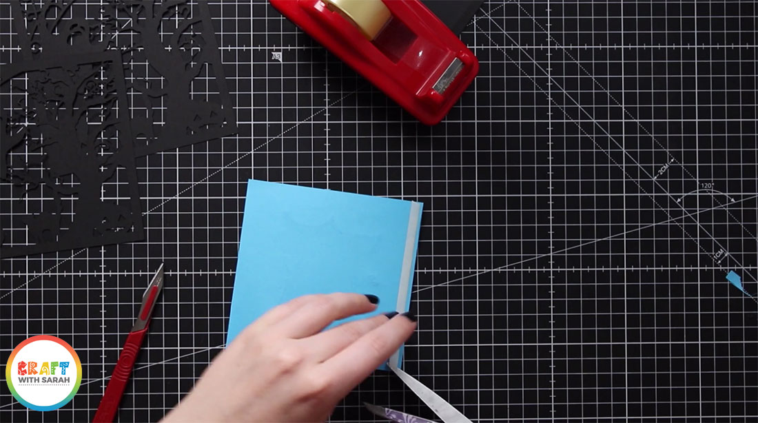
4) Add the front and inside sections
Place thin strips of double sided tape all along the black border on the front of the card.
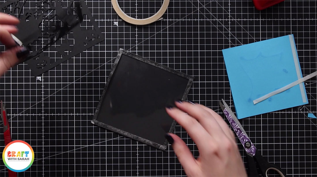
Stick the front panel to the front of the card.
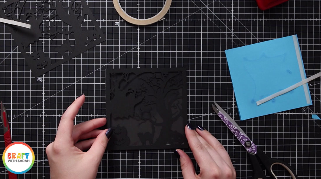
Repeat this step to stick the mirrored panel to the inside of your card.
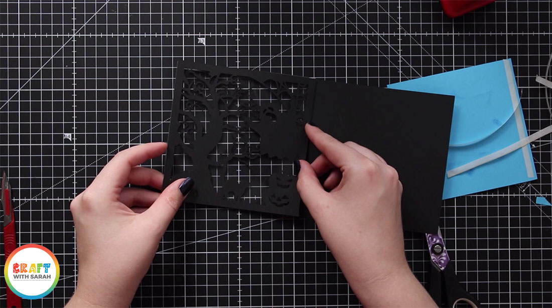
5) Add the insert
Peel the backing off of the sticky tape on the back of your insert and stick it to the inside-right of your card.
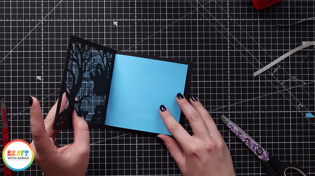
And that’s it… your custom designed acetate window card is finished!
I hope you enjoyed this tutorial on how to design your own acetate window cards in Design Space, and then cut them out with your Cricut machine and stick all of the pieces together to create your finished card.
Happy crafting,
Sarah x
[cws_halloween2020]

